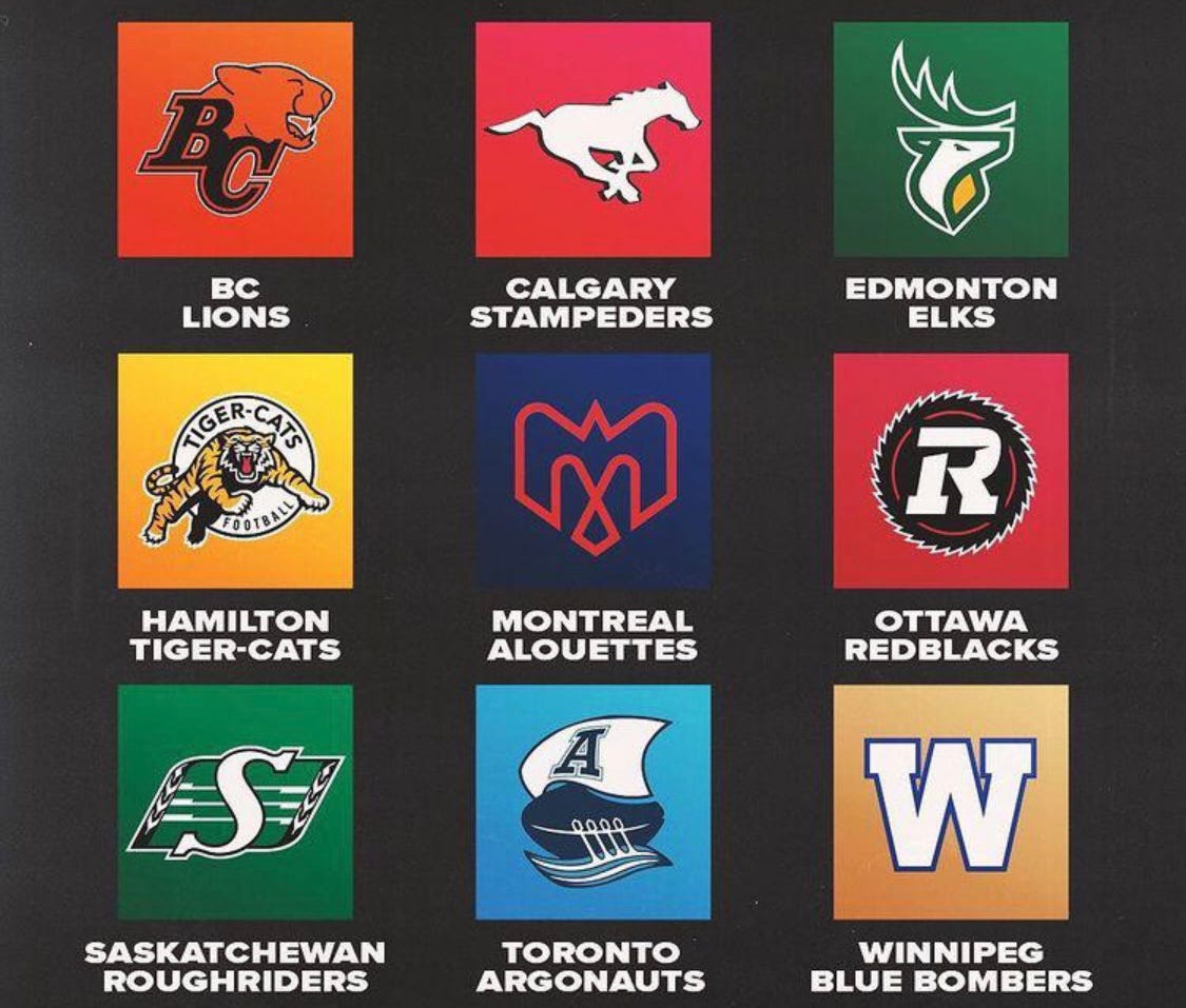
Canadian Football Team Logos Ranked
The Canadian Football League is often the butt of jokes from the country’s southern neighbors. Maybe it has something to do with the differences in the game like playing area, team size, the ball, and number of downs. Few remember there once were United States-based franchises in the league. Do you recall the Sacramento Gold Miners, Las Vegas Posse, Baltimore Stallions, Shreveport Pirates, Birmingham Barracudas and Memphis Mad Dogs? I don’t. In 1995, the Stallions became the only non-Canadian team to win the Grey Cup. The experiment lasted just three years.
In popular television the Canadian league is a punchline. Homer Simpson watches the 15th round of the CFL Draft to avoid Ned Flanders’ barbeque. The character Kramer on Seinfeld only likes Canadian football. 30Rock takes a poke at the game. Without knowing if it sarcasm or tribute, Ashton Kutcher wears a Redblacks tee in several episodes of The Ranch while Dennis Leary rocked a BC Lions shirt in Rescue Me.
Which leads us to the topic, which logo would you proudly wear on a t-shirt. That is what a great logo boils down to … would you become its billboard? Below we rank from worst to best with rationales. See if you agree.
Number 9: Calgary Stampeders
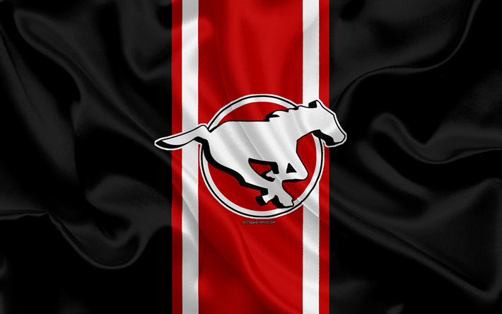
“Together We Ride” is the slogan of the team yet they show one horse. The galloping beast communicates speed and (horse)power. This animal choice makes sense given Calgary’s location, the stampede, and Alberta basically being Canada’s Texas. Even with the warrior colours of red, white and black, the horse is flat and lacks personality. One could argue it is running away. Why the organization seldom includes the team name with the logo is a mystery. There is so much equity in “Stampeders”. I would focus on the name more than a horse in the next inevitable logo update.
Number 8: Ottawa Redblacks
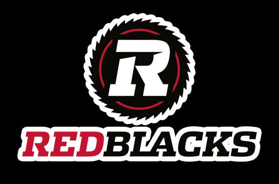
The name was chosen because there were two teams out of nine with the same moniker (which seems like a joke). The Saskatchewan Roughriders enforced their trademark on the Ottawa Rough Riders prompting the change. The name and logo have the weakest origin story I have found in branding. The President of the club once explained that red stands for desire, black stands for power and the white border is supposed to be a sawblade to pay tribute to Ottawa’s logging history. It looks great if you are a microbrewery or weekend motorcycle club but says nothing about football or sports for that matter.
Number 7: Toronto Argonauts
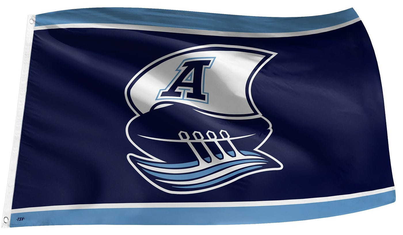
It is hard to believe but this is an improvement over the previous incarnation. It ressurects the first logo from 1873 and basically emulates the version from the 1970’s and 1980’s. While a fine tribute, it fails to recognize how busy and juvenile it comes across. It looks like a bizarre toy from a Cracker Jack box. The waves resemble a pair of skis. The idea of sailing in a football must have come from a fever dream. On a side note, the team’s motto of “Pull Together” has been lampooned for its sexual connotation.
Number 6: Edmonton Elks
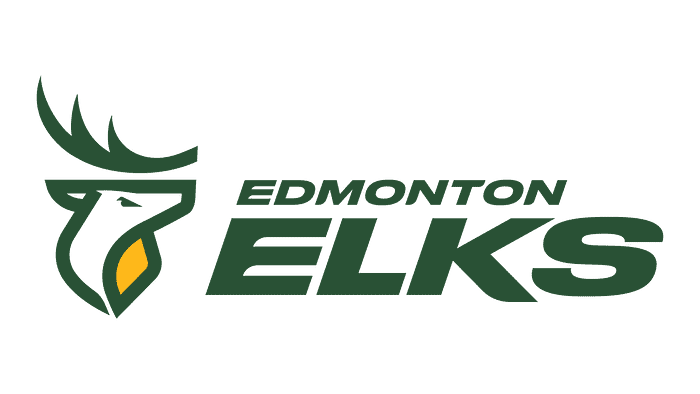
Naming a brand is the first challenge and the team did well with Elks. This was to distance itself from Eskimos which needed to change for obvious reasons. Choosing another “e” word made sense and the elk is a fine animal. I love the logo, wordmark, and colours but not for a football team. The elk looks better suited for the provincial park symbol where it would be amazing and I would wear that t-shirt. It is a headscratcher because so much works but not in this context. Does anyone else fixate on the eye? At first I thought it provided the wrong facial expression now I see it as a tiny duck.
Number 5: BC Lions
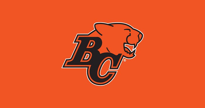
It is amazing this ranks so high. It is basic but not in a cool, minimalistic way. The lettering is very collegiate sports, perhaps too predictable. The lion is more jocular than fierce so the overall impression is safe and timeless but yawn.
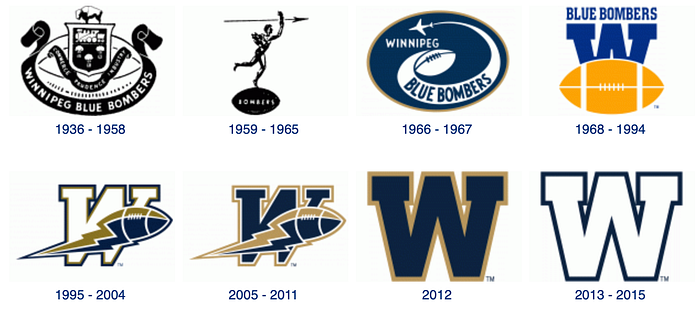
Number 4: Winnipeg Blue Bombers
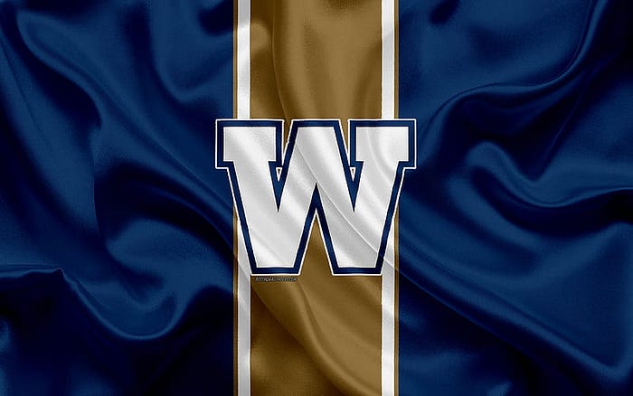
For decades, Winnipeg was fighting the Cold War with teams named after military aircraft. The Bombers and Jets provided a certain synchronicity. I must admit some sentimentality here because Winnipeg is my hometown. For me the Blue Bomber logo is the 1968–1994 version. It is fantastic where the current one is a missed opportunity. The “W” looks great on a helmet but it ends there. It ranks this high only because it truly beats the others even if it is generic. Bring back the football and full name!
Number 3: Hamilton Tiger Cats
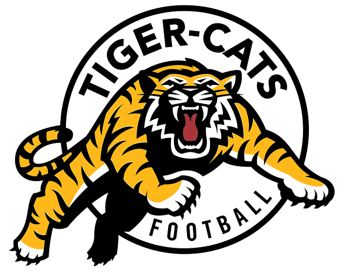
At first glance, this seems like any other sports animal but this is one tough cat. Kudos on the chest and back leg shading, it is nuanced and brilliant. The centred red tongue is super good. The fonts pop without overwhelming. From a design perspective, it is balanced and almost three-dimensional. This is an excellent logo but not super differentiated in the overall sport category. It would look great on a t-shirt but may not earn a second glance which is a shame.
Number 2: Montreal Alouettes
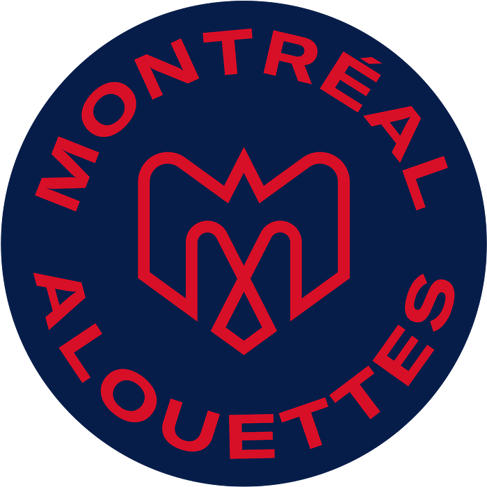
In 2019, the team stated, “We came to the conclusion that our DNA must reflect Montreal’s DNA even more. We intend on better connecting with Montrealers in different areas that define our city such as music, gastronomy, fashion and culture, among other things.” That is asking alot of a team’s logo. Look closely and you will see a bird, plane and a fleur-de-lis all of which tell the history of the team. It ranks this high because it is contemporary but classic. One big caveat, it should always appear this way. When the symbol is used on its own, it does not work.
Number 1: Saskatchewan Roughriders
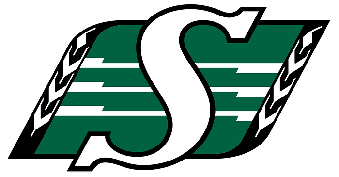
The Roughriders receive a retro boost to rank number one. It is one of the most recognized marks in Canadian sports due to consistency, tenure and quirkyness. The wheat on the sidelines is awesome. The gridlines and superimposed “S” creates a singsong, music association. It has Canadian Friendly Football at its core and demands to be worn as a conversation starter.
And a Bonus Logo
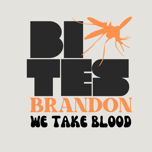
I found a team and logo that never made it into the league. In the 1970’s Brandon, Manitoba approached the CFL for an expansion franchise. Much of Canada is known for the aggressive and persistent insect known as the mosquito but Brandon wanted to own the association. The Brandon Bites may have made a hell of a team. Okay, okay, I made this and the logo up for fun…but it is a logo I would wear.